
Use the visual editor
Edit catalog sections, product cards, images, layouts and page setup, then preview and save.
Select a screenshot to view it at full size.
Before you start
Open Settings → Manage templates and choose Customize on a catalog design you can edit. This guide describes the Product Catalog editor. Product Sheet editing is a separate purpose. Keep a custom-template slot available before saving a new catalog design; check Plans and limits for access.
See Plans and limits for current allowances and access.
A short editor tour
Use the captioned sequence for orientation, then follow the focused steps below. The sequence shows captured states and does not save a design.
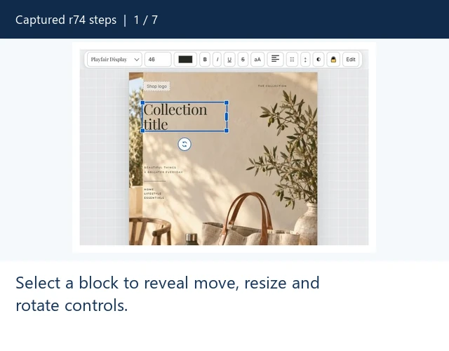
Find your way around the visual editor
A silent sequence of captured app states, with captions. This is a step walkthrough, not a continuous screen recording.
Paused. You can also read every step below.
Read the walkthrough steps
- Select a block to reveal move, resize and rotate controls.
- Use the selected block toolbar for bundled fonts and text color.
- Catalog pages Layout controls Grid or eligible List use, columns and rows.
- Layers selects blocks and exposes visibility, lock and ordering controls.
- Choose an applicable page section, then use Assets search and categories.
- Setup changes document paper size and orientation; recheck every section.
- Preview checks sample output. Save persists changes; neither action was triggered in these captures.
Step 1 — Choose the section
- Open Customize for the design.
- Use the expand control labelled Open editor full screen if you need more space.
- Choose Cover, Catalog pages, Product card or Back cover.
- Open a tool on the left: Layout, Layers, Assets, Setup or Properties.
The section tab determines what you are editing. Product card defines the repeated card style rather than one particular Shopify product. The canvas uses representative sample content until a final catalog is generated.

Step 2 — Review the cover and back cover
- Choose Cover or Back cover before working with its blocks.
- Open Layout to review whether that optional page is included.
- Select its text, logo, photograph or graphic to show the relevant controls.
- Check that the page still reads clearly after changing text or image proportions.
Removing an optional cover starts the PDF with products. Review the complete page sequence before saving. Switching section tabs selects another editing context; it does not create a new template.
Step 3 — Select and style a block
- Select a text, image or other block on the canvas, or select its entry in Layers.
- Drag the selected block to move it. Use the visible resize handles to adjust its frame.
- For a text block, use its text controls to edit text and choose a bundled font, size, color and alignment.
- Use Properties for controls supported by that block type. Check that the selection is correct before applying a style.
- Use Undo or Redo to review an unintended edit while working.
Keep enough space for long product titles and descriptions. A product-bound title/description is filled from Shopify in final output; static text remains the text in your design. Font choices come from the bundled menu. A locked layer must be unlocked before moving it.
Moving versus resizing: drag the selected block itself to change its position; drag a corner or edge handle to change the frame. The rotate control is separate. If the wrong block is selected, use Layers to select by name before dragging. Use Undo for an unintended draft edit.


Step 4 — Arrange the catalog pages
- Choose Catalog pages and open Layout.
- Choose Grid, or List when your plan permits new List use.
- For Grid, set Columns and Rows. Their product determines the products placed on a full page.
- Review the incomplete-last-row alignment and supported gap/background controls.
- Switch to Product card to adjust its image, title, description and price layout.
Grid is available on every plan. New List use requires Starter or higher. Business supports the product metafield block for supported synchronized values. Changes to the shared card affect cards throughout the catalog. Inspect both a full page and long text before final printing.

Step 5 — Work with the shared card and layers
- Open Layers and select the block you want to work on.
- Use Bring forward or Send backward to change the stacking position; top entries appear in front.
- Use Hide to control visibility or Lock to protect a block from accidental movement.
- Use Duplicate or Delete only when you intend to change the design, then inspect the result.
If a block appears missing, check whether it is hidden or covered by another layer. If it will not move, check its lock.
Use Product card to style the repeating product image, title, description and price. Library decorations are restricted in this context; choose an applicable page section before using those assets.

Step 6 — Find the right images
- Open Assets, then Nezify library or My uploads.
- Choose the intended image action for a selected image/frame, or drag a supported asset onto the canvas.
- Check the image crop, proportions and layer position.
New merchant uploads require a paid plan and available capacity. For background and deletion instructions, read Images and assets.

Step 7 — Check setup, preview and save
- Open Setup and review Paper size (A4 or US Letter) and Orientation (Portrait or Landscape).
- After changing dimensions, inspect Cover, Catalog pages, Product card and Back cover again. Page content frames and backgrounds are controlled in each section’s Layout panel.
- Choose Preview PDF to inspect the design using sample products. Preview does not use final PDF allowance.
- Choose Save and finish the custom-template confirmation when creating a new design.
- Use the saved template for an actual collection only when ready to create final output.
Expected result: a reusable custom template, within your plan’s active-template allowance. Preview is not proof that every real product title or image fits; inspect your final document before distribution or printing.


Expected result
The saved custom template reopens with the intended page sections, shared card style, images and document setup. The final catalog still needs inspection with real product content; sample Preview text cannot expose every long-title or image-proportion case.
Important notes before saving
- Save persists a design. A built-in Save flow creates a custom template; an existing custom Save can update that reusable design.
- Preview uses sample data and does not consume final-render allowance.
- Layout and block access can depend on the plan. New List use and new uploads require eligible access.
- Changing page dimensions can affect every section; recheck the whole document.
Troubleshooting the editor
- Cannot move a block: check its lock in Layers and whether the intended block is selected.
- Missing controls: selection type and editing context determine the toolbar.
- Asset disabled: check the page context and plan, including the Product card decoration restriction.
- Text cut off: increase its frame or shorten static text, then inspect Preview and final real-product output.